Daily Needs — Adaptive Commerce
How might one commerce platform serve B2C, B2B, D2C and Premium customers without becoming four disconnected websites?
- Domain
- Ecommerce / Multi-experience retail platform
- Role
- UX / Product Designer (solo)
- Duration
- Design assessment engagement
- Team
- Solo
- Status
- Design direction / high-fidelity concept
- Research
- Secondary market research · Assessment-supplied industry figures
- Platforms
- Desktop web (1440px) · Mobile web (390px)
- Type
- Design assessment · Multi-experience ecommerce ecosystem
01
The problem
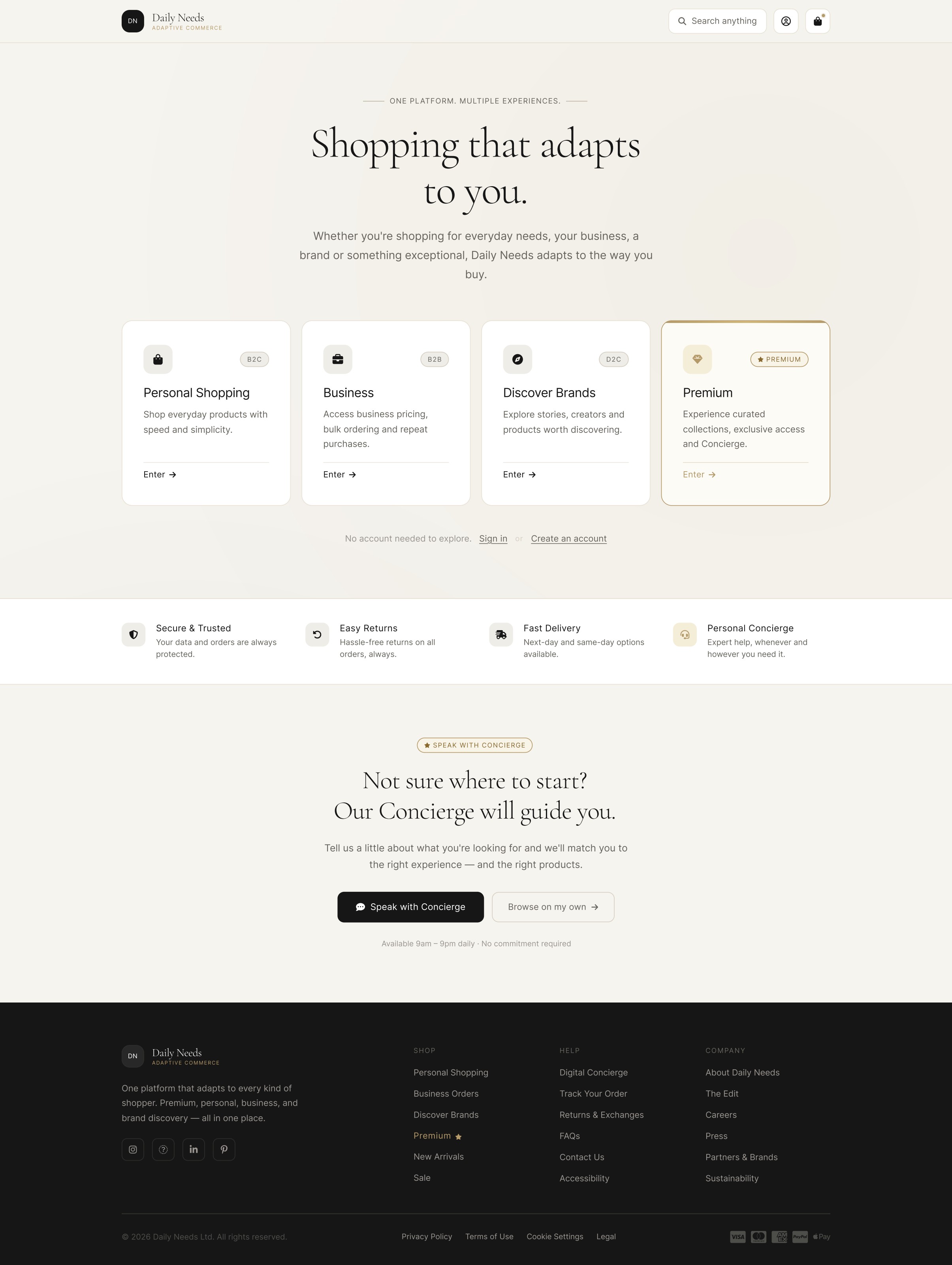
Daily Needs was a traditional B2C ecommerce platform being asked to serve four very different customers at once: everyday shoppers, business buyers, brand-discovery customers and high-value premium customers.
The obvious answer would have been four websites. That is the answer I rejected. Different customers do not need different brands — they need different information hierarchy, density, pricing logic, workflows and assistance.
Redefined problem statement
How might we transform Daily Needs from a traditional B2C e-commerce platform into a unified, premium digital ecosystem that seamlessly serves B2C, B2B, D2C and Premium customers while keeping the experience simple, intuitive and engaging?
Before
- Generic journeys for every customer type
- Irrelevant information and cognitive overload
- Inefficient, sales-dependent B2B buying
- Weak personalisation
- No meaningful Premium differentiation
- Decision paralysis
After
- B2C is fast
- B2B is efficient
- D2C is engaging
- Premium is curated
- One brand, one design system throughout
- Assistance offered, never forced
The intended shift. Validation of these outcomes with real users has not been conducted.
02
Who I designed for
B2C shopper
Speed
- Search → product → price → buy
- Minimal interface
- No decisions they didn't ask for
B2B buyer
Efficiency
- SKU and quantity first
- Tier pricing and availability
- Reorder, saved lists, invoices, PO references
D2C explorer
Discovery
- Brand story before product
- Creators and community
- Reasons to care, not just to buy
Premium customer
Curation
- Collection and narrative
- Trust and provenance
- Concierge assistance on request
Research context
The assessment supplied market and behavioural research. The B2B self-service findings shaped the most consequential decisions: 83% prefer self-service online ordering, 73% are willing to place orders above $50K digitally, and 100% want to self-serve at least part of the journey.
These figures were supplied as assessment inputs. I used them to direct design decisions, not as claims of my own measured results.
03
Design exploration
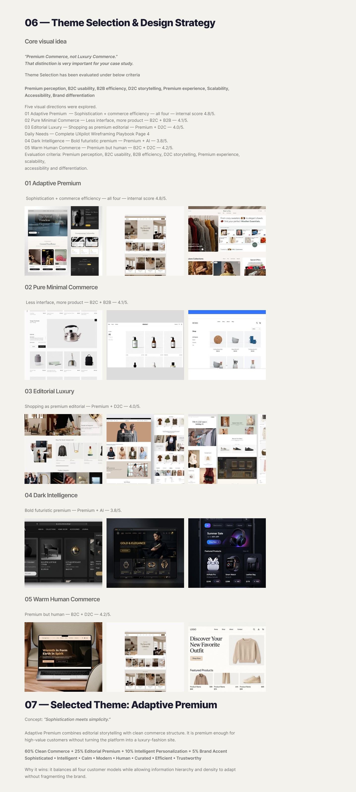
Divergent thinking produced fifteen possible moves — segment-aware entry, adaptive navigation, dynamic product cards, quick order, tiered pricing, editorial collections, digital concierge, creator discovery, AI-assisted discovery, trust architecture and progressive disclosure among them.
Convergent thinking scored five visual directions against premium perception, B2C usability, B2B efficiency, D2C storytelling, scalability, accessibility and differentiation.
Five directions explored
- 01 Adaptive Premium
- Sophistication + commerce efficiency — serves all four — 4.8/5
- 02 Pure Minimal Commerce
- Less interface, more product — B2C + B2B — 4.1/5
- 03 Editorial Luxury
- Shopping as premium editorial — Premium + D2C — 4.0/5
- 04 Dark Intelligence
- Bold futuristic premium — Premium + AI — 3.8/5
- 05 Warm Human Commerce
- Premium but human — B2C + D2C — 4.2/5
The problem
Should the four customer types get four tailored sites, or one system that adapts?
Explored
Four separate storefronts — perfectly tailored, four times the maintenance and four brands
Explored
One generic storefront — cheap to run, relevant to no one
Explored
One design system with four experience modes
Decision
One design system with four experience modes.
Why
Tailoring lives in information hierarchy and interaction patterns, not in brand or components. A shared token and component layer keeps the brand coherent and lets the platform add a fifth mode later without a redesign.
04
The chosen direction — Adaptive Premium
Premium Commerce, not Luxury.
That distinction carried the whole project. Luxury signals exclusion; premium signals care. A grocery-and-office-supplies platform that dresses as a luxury fashion house loses its everyday shopper in the first three seconds.
Adaptive Premium mixes 60% clean commerce, 25% editorial premium, 10% intelligent personalisation and 5% brand accent — sophisticated, calm, efficient and human at the same time.
Four modes, one system
- B2C — Search · Product · Price · CTA
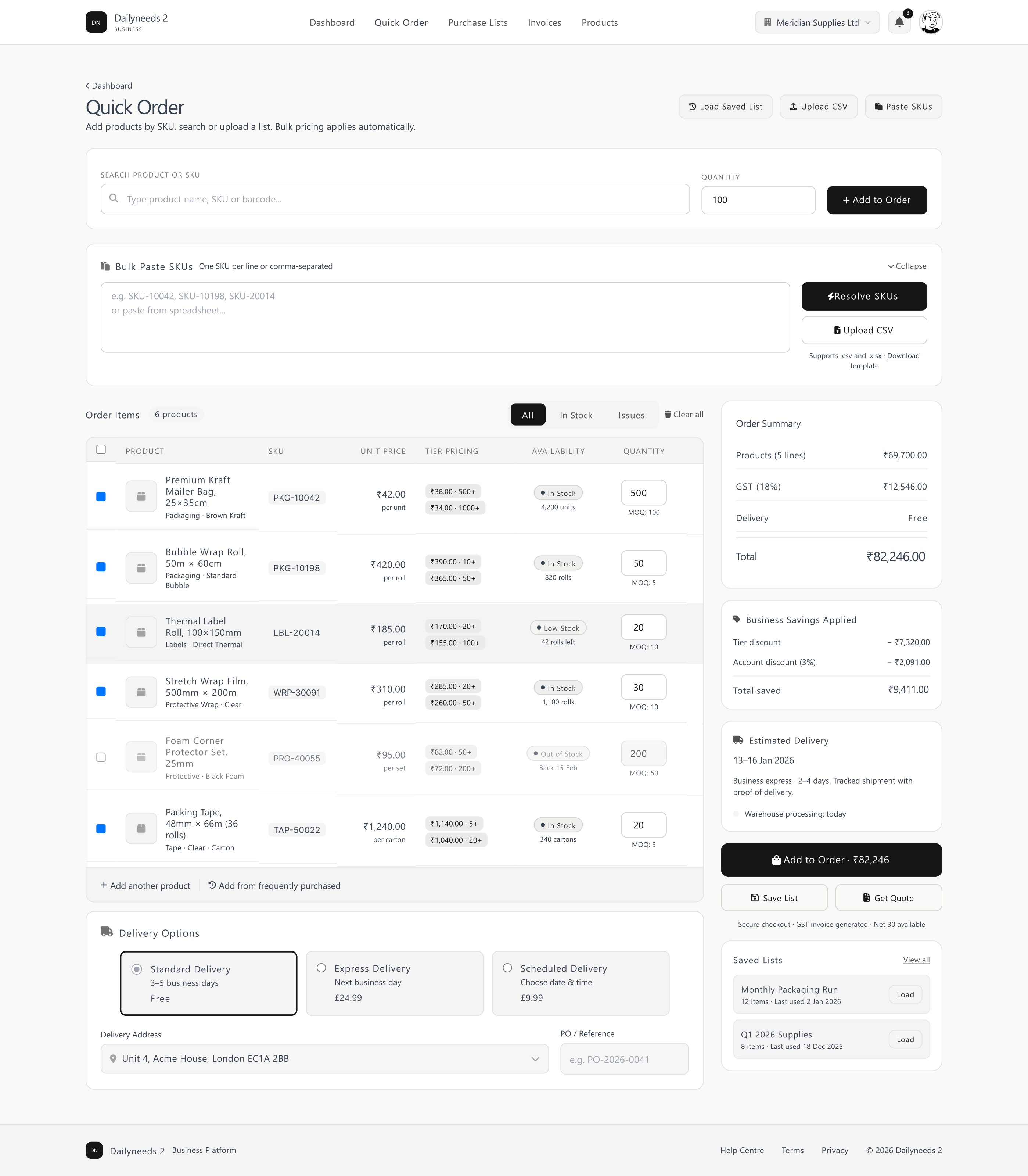
- B2B — SKU · Quantity · Tier price · Availability · Order
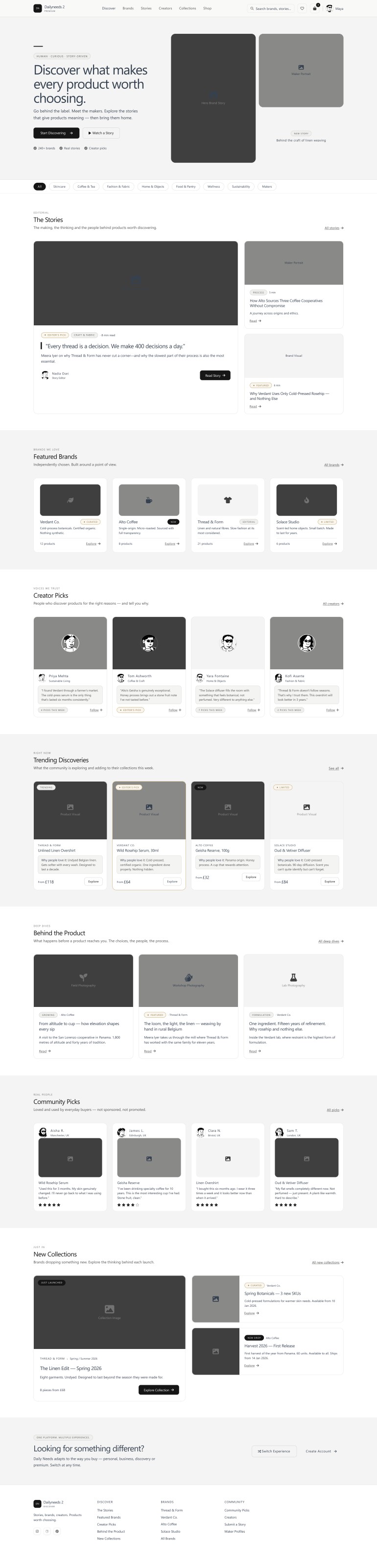
- D2C — Story · Brand · Community · Product
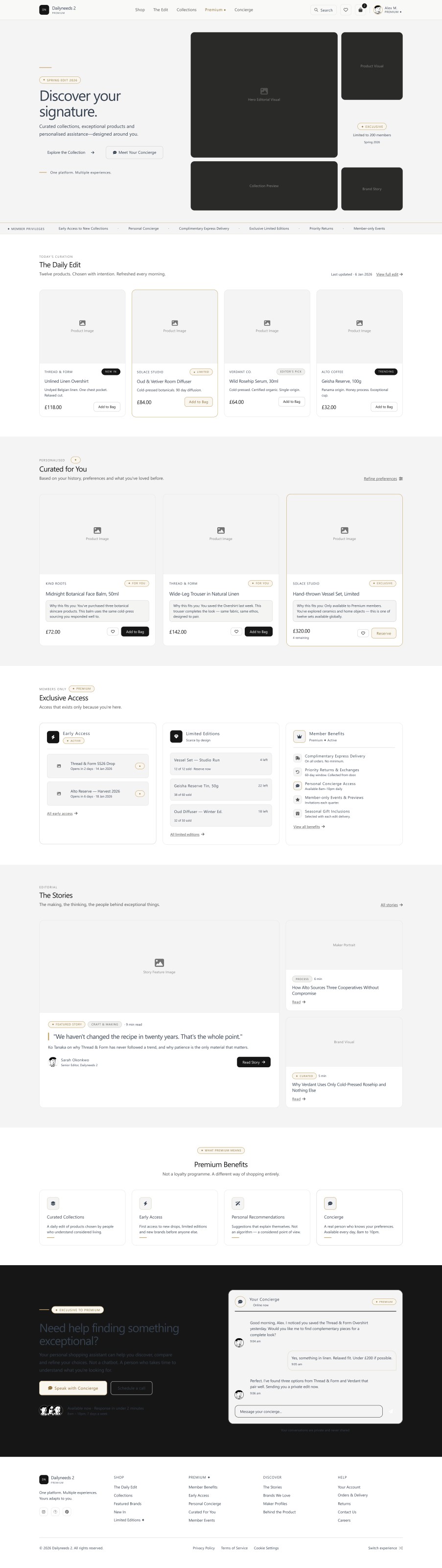
- Premium — Collection · Narrative · Trust · Product · Concierge
Same brand. Same design tokens. Same components. Different information hierarchy.
05
The visual system
The problem
Gold reads as premium — so how much gold?
Explored
Gold across primary CTAs and product cards for a consistently luxe feel
Explored
No gold at all — keep it strictly neutral
Explored
Gold as a selective signal reserved for Premium states
Decision
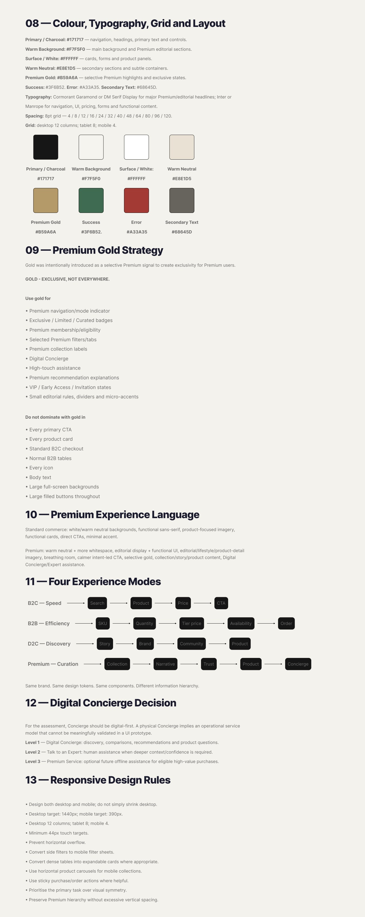
Gold as a selective signal only.
Why
If gold is everywhere it means nothing. Reserving it for Premium mode indicators, curated badges, concierge and exclusive access turns a colour into information: when a customer sees gold, something genuinely premium is happening.
Gold is used for
- Premium mode indicator in navigation
- Exclusive / Limited / Curated badges
- Membership and eligibility states
- Selected Premium filters and tabs
- Digital Concierge and high-touch assistance
- Personalised recommendation explanations
- VIP, early access and invitation states
- Fine editorial rules and dividers
Gold is never used for
- Every primary CTA
- Every product card
- Standard B2C checkout
- Normal B2B tables
- Every icon
- Body text
- Full-screen backgrounds
- Large filled buttons
06
The experience
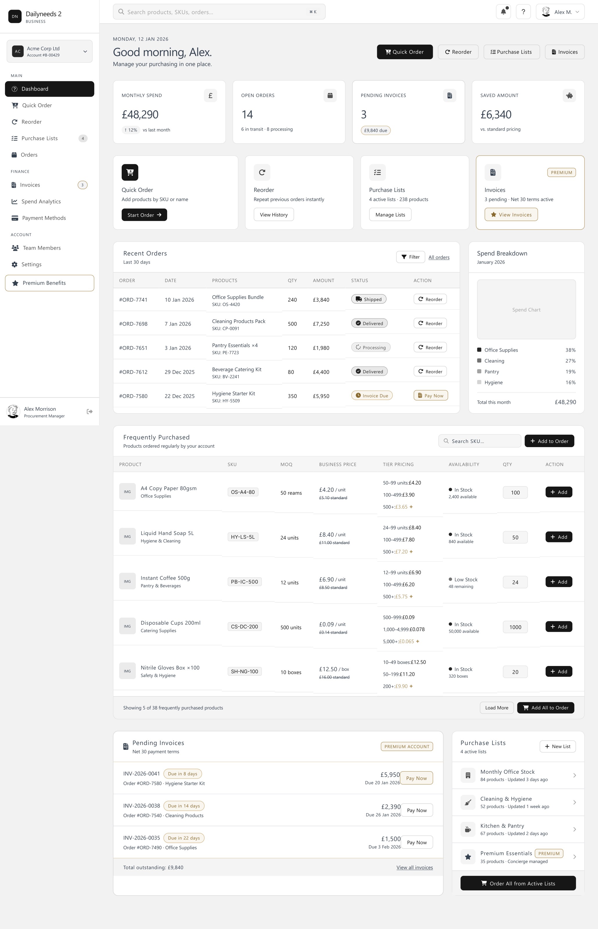
B2B — efficiency
The business dashboard puts purchasing work first: spend, open orders, pending invoices, quick order, reorder and saved purchase lists. Tier pricing sits inline against each SKU so a buyer never has to ask a rep what a quantity actually costs.
Premium — curation and concierge
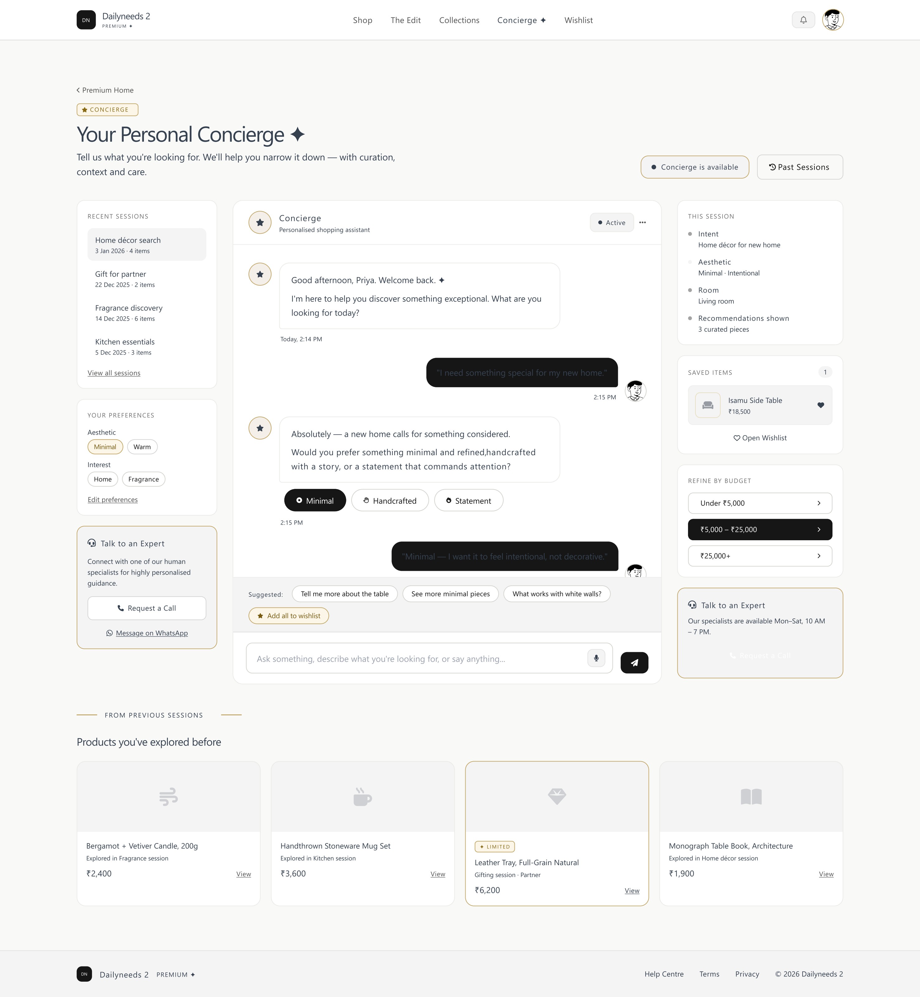
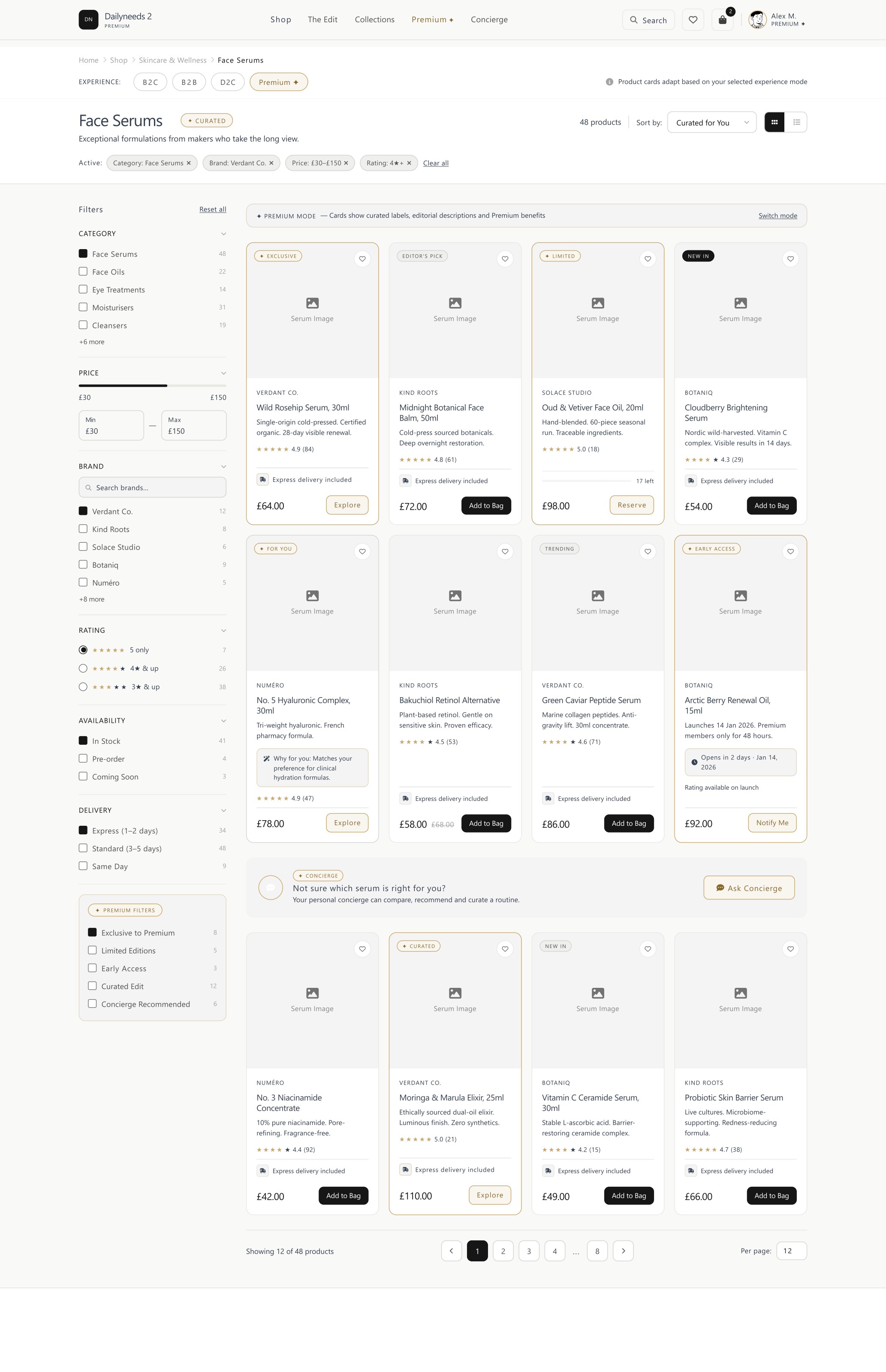
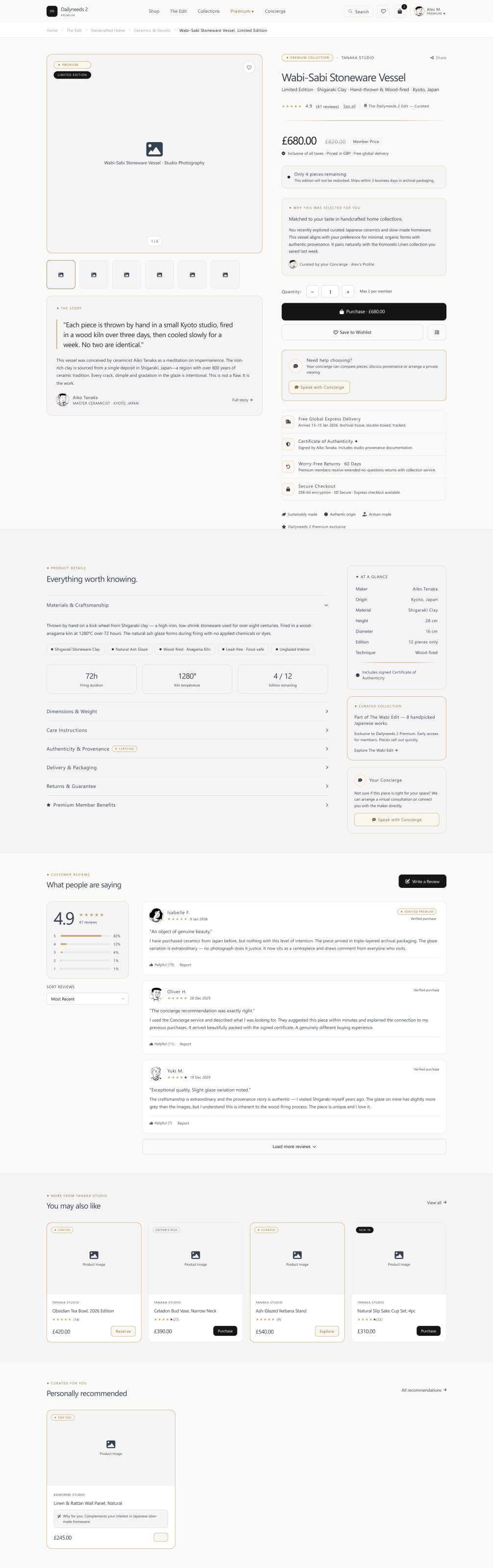
Premium mode slows the interface down: more whitespace, editorial display type, narrative before specification, provenance and trust ahead of the add-to-bag. The Concierge is deliberately digital-first.
The problem
Should the Premium Concierge be a human service or a digital one?
Explored
Physical concierge — highest touch, implies an operational service model
Explored
Digital-first concierge with escalation to a human expert
Decision
Digital-first, with three escalation levels.
Why
A physical concierge implies staffing, SLAs and an operating model that a UI prototype cannot honestly validate. Level 1 handles discovery and comparisons digitally, Level 2 escalates to a human expert, Level 3 leaves room for offline service on eligible high-value purchases.
D2C — discovery
D2C leads with the story: brands, makers, creators and collections come before the grid. Product is the conclusion of the narrative rather than its opening line.
Adaptive product cards
The clearest proof that this is one system and not four sites: the same listing page and the same card component change what they surface as the experience mode changes — price and speed for B2C, SKU and tier pricing for B2B, maker and story for D2C, curation and provenance for Premium.
One cart, four experiences
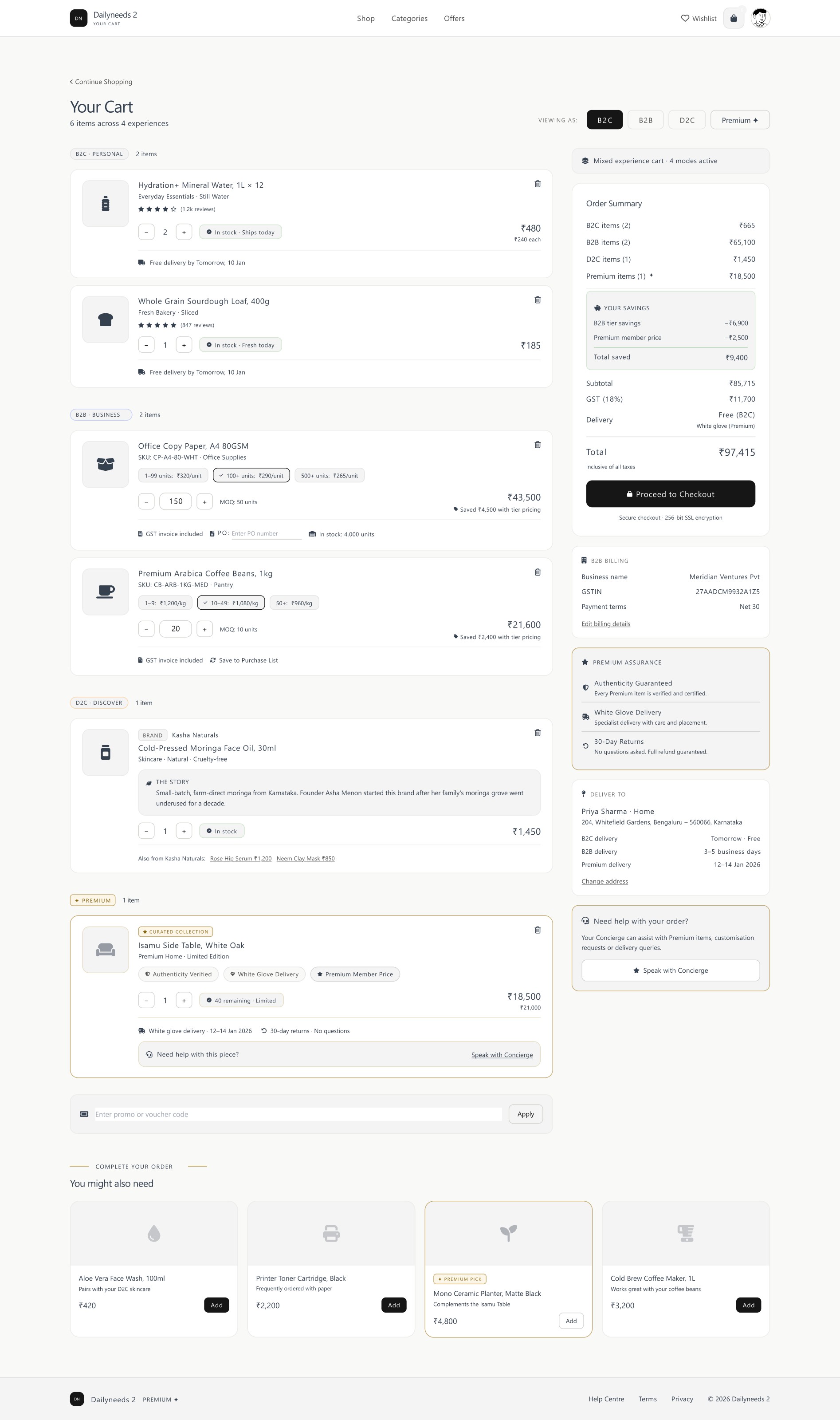
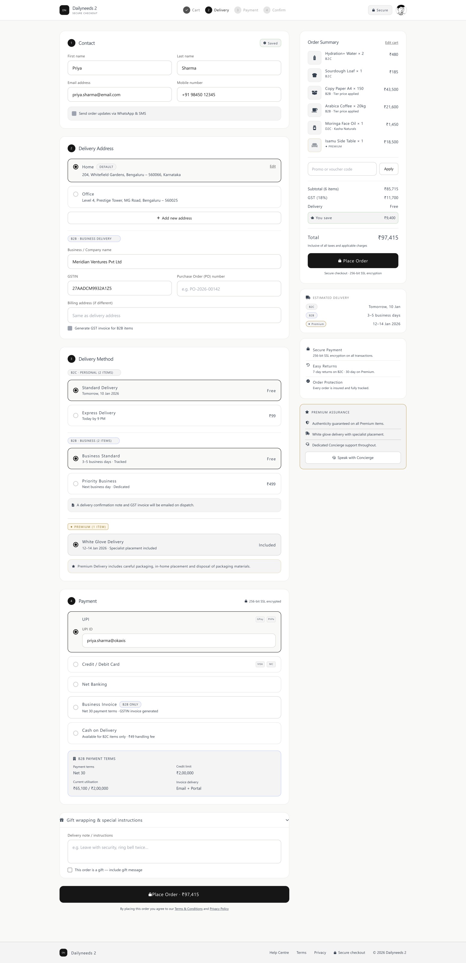
The hardest screen in the project. A single customer can hold everyday items, business stock and a curated premium piece at once, so the cart groups by experience while keeping one checkout — the platform adapts, the customer never has to.
07
Responsive rules
Rules I designed to
- Design desktop (1440px) and mobile (390px) separately — never shrink one into the other
- 12 columns desktop, 8 tablet, 4 mobile on an 8pt spacing scale
- Minimum 44px touch targets; no horizontal overflow at any width
- Side filters become mobile filter sheets
- Dense B2B tables become expandable cards
- Sticky purchase actions where the task benefits
- Prioritise the primary task over visual symmetry
- Keep Premium hierarchy without inflating vertical space on small screens
08
Outcome
The deliverable is a complete adaptive commerce direction: a scored theme decision, a token and component system, four experience modes and end-to-end high-fidelity screens across desktop and mobile.
No business performance figures are claimed. This is a design assessment, not a shipped product — conversion, efficiency and satisfaction outcomes remain to be validated with real users.
Reflection
What I learned
- 01"Premium" is a hierarchy decision before it is a visual one. Whitespace, sequence and restraint did more for the premium feel than any decorative treatment.
- 02A colour becomes information when you ration it. Reserving gold for Premium states made it legible as a signal rather than decoration.
- 03Designing for four audiences exposes weak components fast — anything that could not change its hierarchy without breaking was the wrong abstraction.
- 04Choosing a digital-first concierge taught me to keep design promises inside what the product can actually deliver.
- 05Supplied research is direction, not proof. I used the B2B self-service findings to steer decisions, and kept them labelled as inputs rather than results.
Case study summary
- Problem
- One platform had to serve B2C, B2B, D2C and Premium customers without fragmenting into four sites
- My contribution
- Sole designer — research synthesis, direction, design system and all high-fidelity screens
- Key decision
- One design system with four experience modes, and gold as a rationed Premium signal
- Outcome
- Complete adaptive commerce direction; performance metrics to be validated
- Main learning
- Premium is a hierarchy decision before it is a visual one
Media I need from you
Upload order for this case study
Send them one at a time and I'll place each one exactly where it belongs. Start with Essential — the case study reads correctly once those are in.
Essential
- Homepage
- B2B dashboard
- Premium concierge
- Adaptive product cards
- Cart and checkout
Important
- Theme explorations
- Design system foundations
- Mobile screens
- Quick order
Optional
- Prototype recording
- Wireframes
- Walkthrough video